
이 튜토리얼을 작성하는 시점에서 CSS 그리드는 76 %의 브라우저에서 지원되며 여기에서부터 지원이 늘어날 것입니다.
CSS 그리드를 사용하면 컨텐츠를 breeze로 쉽고 빠르게 배치하고 정렬 할 수 있습니다.
프로젝트 시작 및 실행
우리는 엄격하게 HTML과 CSS로만 작업 할 예정이지만 최소한 라이브 브라우저 재로드와 Gulp 및 브라우저 동기화를 통합하려고합니다. 이것은 내 인생을 교사로 더 쉽게 만들 것입니다. 또한 Gulp 파일을 확장하여 sass를 허용하거나 다른 멋진 일을 수행하려면 다음과 같이 할 수 있습니다.
먼저,이 파트에 대해 Node.js가 필요합니다 ( 아직 Nodejs.org에 설치 하지 않은 경우 이를 설치하십시오 ).
새 프로젝트 폴더를 만들고 그 안에 들어가십시오.
> mkdir css-align && cd css-align프로젝트 종속성을 유지할 package.json 파일을 만듭니다.
> npm init -yNPM을 사용하여 Gulp 및 Browser-sync를 설치하십시오.
> npm install gulp browser-sync --save-dev다음으로 프로젝트 폴더에 다음을 입력하여 Visual Studio 코드를 엽니 다.
> code .다음 내용으로 프로젝트 폴더에 index.html 파일을 만듭니다. (VSC에!를 입력하고 엔터를 누르면 다음과 같은 상용구 HTML이 제공됩니다.)
<!DOCTYPE html>
<html lang="en">
<head>
    <meta charset="UTF-8">
    <meta name="viewport" content="width=device-width, initial-scale=1.0">
    <meta http-equiv="X-UA-Compatible" content="ie=edge">
    <title>CSS Grid Alignment Playground</title>
    <link rel="stylesheet" href="css/main.css">
</head>
<body>

</body>
</html>
알림 또한 css / main.css 에 대한 참조를 추가했습니다 .
그래서, 그 안에 css 폴더와 빈 main.css 파일을 만듭니다 .
그런 다음 프로젝트 폴더에 gulpfile.js 라는 파일을 만들고 다음 내용을 붙여 넣습니다.
var gulp    = require('gulp');
var browserSync = require('browser-sync').create();

gulp.task('sync', function() {

    browserSync.init({
        server: {
            baseDir: "./"
        }
    });

    gulp.watch(["./*.html", "./css/*.css"]).on('change', browserSync.reload);
})
이렇게하면 HTML 또는 CSS 파일이 저장 될 때마다 브라우저가 자동으로 다시로드됩니다.
마지막으로 프로젝트 폴더 내의 명령 줄에서 g 프 동기화 를 실행 합니다.
> gulp sync그러면 프로젝트와 함께 http : // localhost : 3000에 브라우저가 시작됩니다 . 이제 갈 준비가되었습니다!
CSS 그리드로 수평 및 수직 중심 맞춤
HTML을 사용하여 작업을 단순하게 만들고 수평 및 수직으로 배치 할 단일 컨테이너를 정의 해 봅시다.
<body>
    <div class="container">
        <h1>My Content</h1>
        <p>My paragraph content right here.</p>
    </div>
</body>
우리의 신체 태그는 실제 그리드 컨테이너와 자식 요소로 역할을 할 것이다. 컨테이너 는 우리가 수평 및 수직으로 중심을 정할 것입니다.
에서 main.css가의 파일 추가 :
body, html {
    margin: 0;
    height: 100%;
    font-family: 'Arial';
}

body {
    display: grid;
    grid-template-rows: auto;
    justify-items: center;
    align-items: center;
}

.container {
    grid-column-start: 1;

    background: rgb(230, 230, 230);
    border-radius: 10px;
    padding: 1em;
}
그래서, 여기서 무슨 일이 일어나고있는거야?
먼저 body 요소를 display : grid가 있는 표 컨테이너로 만듭니다 . 다음으로, 우리는 단지 1 행의 내용을 가지고 있으므로 grid-template-rows 를 auto로 설정 합니다.
다음 두 속성은 모든 센터링 마법을 발생시키는 것입니다.
- justify-items -이 속성은 주어진 값을 기반으로 모든 모눈 항목 ( #container 가 단일 그리드 항목 임)을 행 축에 정렬해야한다고 주장합니다. 우리의 경우에는 중심 입니다.
- align-items -이 속성은 열 축을 기준으로 정렬하는 것을 제외하고 는 justify-items 와 같습니다 .
브라우저의 결과는 다음과 같습니다.

브라우저의 크기를 조정하면 두 축의 중심에 절대 위치가 유지됩니다.
여러 항목 가운데 맞추기
우리는 단지 하나의 그리드 아이템을 중심에 두었습니다. 추가 개념을 보여주기 위해 2 가지를 추가해 봅시다.
다음과 같이 HTML을 업데이트하십시오.
<div class="container" id="item1">
<h1>My Content</h1>
<p>My paragraph content right here.</p>
</div>
<div class="container" id="item2">
<h1>My Content 2</h1>
<p>My paragraph content right here.</p>
</div>
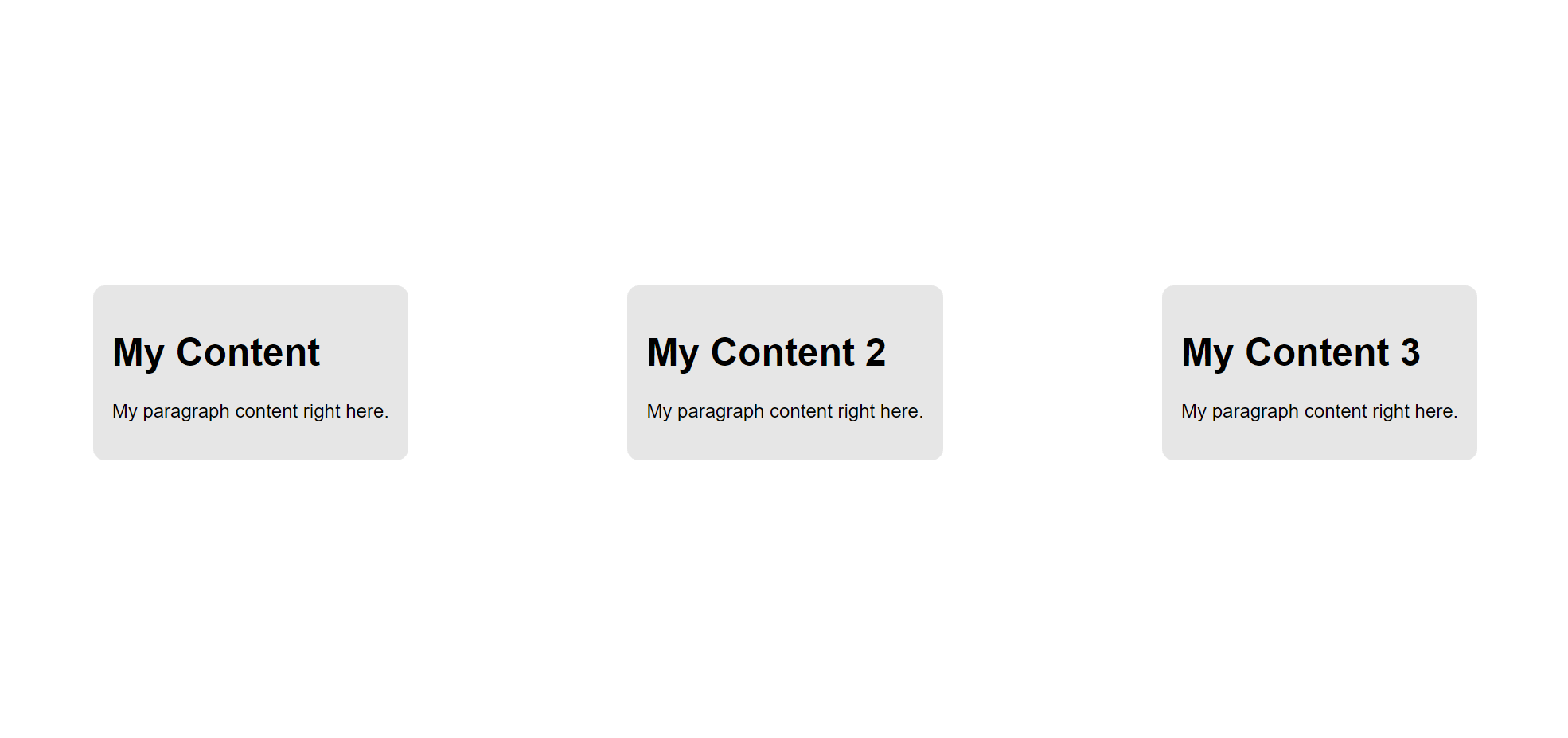
<div class="container" id="item3">
<h1>My Content 3</h1>
<p>My paragraph content right here.</p>
</div>브라우저의 결과는 다음과 같습니다.

기둥 대신에, 우리는 어떻게 서로를 모두 같은 줄에 정렬합니까?
CSS를 다음과 같이 업데이트하십시오 :
body {
    margin: 0;

    display: grid;
    grid-template-rows: auto;
    grid-template-columns: repeat(3, auto);
    grid-template-areas:
        "item1 item2 item3";

    justify-items: center;
    align-items: center;
}
여기서는 grid-template-columns를 추가 하고 repeat () 함수를 사용하여 3 개의 열을 만들었습니다. 모두 auto 값 을가 집니다.
grid-template-areas 를 추가 하여 두 행을 구조화하고 (이 경우 3 행 1 행) 각 그리드 영역에 이름을 부여 할 수 있습니다.
이 이름 ( item1 2와 3)은 자식 요소에서 참조 될 수 있지만, 잠시 후에 그 이름으로 갑니다.
브라우저를 체크 아웃하면 다음과 같이 표시됩니다.
굉장해!
단일 항목 맞추기
지금까지 우리는 격자 항목 컨테이너의 모든 격자 항목 정렬을 처리하기 위해 justify-items 및 align-items속성을 사용했습니다.
하지만 개별 그리드 항목의 정렬 만 제어하고 싶다면 어떻게해야할까요?
단순한!
세 가지 그리드 아이템을 각각 독특한 방식으로 정렬 해 봅시다. 먼저 격자 컨테이너에서 justify-items 및 align-items 속성을 제거합니다 .
body {
    margin: 0;

    display: grid;
    grid-template-rows: auto;
    grid-template-columns: repeat(3, auto);
    grid-template-areas:
        "item1 item2 item3";
}
다음으로, 각 자식 컨테이너에 대해 justify-self 및 align-self 를 사용합니다. 또한 grid-area 속성을 사용 하여 부모 컨테이너에 정의한 격자 템플릿 영역 과 일치시킵니다 .
#item1 {
    grid-area: item1;
    justify-self: end;     /* Aligns to the right */
    align-self: start;     /* Aligns to the top   */
}

#item2 {
    grid-area: item2;
    justify-self: start;  /* Aligns to the left    */
    align-self: end;      /* Aligns to the bottom  */
}

#item3 {
    grid-area: item3;
    justify-self: center;  /* We know this already */
    align-self: center;    /* We know this already */
}
결과는 다음과 같아야합니다.

쉬운! 앞에서 방금 언급 한 네 가지 속성 모두 동일한 4 가지 값을 허용합니다.
- justify-items - 시작 | 끝 | 센터 | 뻗기
- 정당화하다
- 정렬 항목
- 정렬하다
이 4 가지 속성과 작동 방식을 이해하고 나면 CSS 그리드를 사용하여 정렬 작업을 수행 할 수 있습니다.
근육 기억 장치가있는 곳이므로, 정렬을위한 몇 가지 다른 일반적인 사용 사례를 살펴 보겠습니다.
CSS 그리드로 하단에 맞 춥니 다.
일반적으로 레이아웃에 꼬리말을 두는 것이 일반적이며, 바닥 글을 브라우저의 맨 아래에 두는 것이 일반적입니다.
우리의 HTML에서 모든 것을 고치고 다음과 같은 시장에서 새로 시작합시다.
<body>
    <div class="content">
        <p>My content</p>
    </div>
    <footer>
        <p>This is my footer bar</p>
    </footer>
</body>
다음으로 body의 html {} 룰 세트를 제외 하고 현재 main.css의 모든 것을 제거 하고 이것을 추가하십시오.
body {
    margin: 0;

    display: grid;
    grid-template-rows: auto 50px;
    grid-template-areas:
        "content"
        "footer";
}

.content {
    grid-area: content; /* This is not necessary for this to work
                           but I'm naming it for future use */
    justify-self: center;
    align-self: center;
}
footer {
    grid-area: footer; /* This is not necessary for this to work
                          but I'm naming it for future use */

    background-color: lightgray;
    padding:10px;
}
결과는 다음과 같아야합니다.

아, 너무 쉬워. 사이드 바를 추가해 보겠습니다.
CSS 그리드에 사이드 바 추가하기
기본 콘텐츠 섹션과 바닥 글이 있으며 UI 왼쪽에 사이드 바를 추가 해보겠습니다.
HTML을 다음과 같이 조정하십시오.
<body>
    <aside>
        <ul>
            <li><a href="#">Home</a></li>
            <li><a href="#">About</a></li>
            <li><a href="#">Services</a></li>
            <li><a href="#">Contact</a></li>
        </ul>
    </aside>
    <div class="content">
        <p>My content</p>
    </div>
    <footer>
        <p>This is my footer bar</p>
    </footer>
</body>
이제 우리 CSS에서 2 개의 열을 만들고 rows 속성과 grid 템플릿 영역 속성을 조정해야합니다.
body {
    margin: 0;

    display: grid;
    grid-template-rows: auto 50px;
    grid-template-columns: 12% auto;
    grid-template-areas:
        "sidebar content"
        "footer footer";
}

aside {
    grid-area: sidebar;
    background-color: gray;
}

/* This stuff below didn't change at all */

.content {
    grid-area: content; /* This is not necessary for this to work
                           but I'm naming it for future use */
    justify-self: center;
    align-self: center;
}
footer {
    grid-area: footer; /* This is not necessary for this to work
                           but I'm naming it for future use */
    background-color: lightgray;
    padding:10px;
}
결과는 다음과 같아야합니다.

'개발 > CSS3' 카테고리의 다른 글
| Bulma CSS를 기반으로 Adobe XD를 사용하여 웹 응용 프로그램 디자인 (0) | 2018.03.11 |
|---|---|
| 세로 배치, 맞춤을 위해 CSS Flexbox 사용 (0) | 2018.03.11 |
| CSS 그리드 예제 배우기 (새로운 CSS 그리드 튜토리얼) (0) | 2018.03.11 |
| CSS 활용을위한 PostCSS 자습서 (0) | 2018.03.11 |